My work experience
I've worked for:
Advancing educational opportunities at Houston Community College
I'm currently doing a contract role for a community college with 70,000 students in Texas. The team I'm working on is less than a year old, and our work is focused on testing live websites to find existing accessibility issues.
A group of almost 80 sites was identified for our team to review, including sites owned by the school as well as third party tools that students, teachers, and staff use. Sites were prioritized by level of use and importance, and we collaborate with our project manager to determine a subset of pages to test within each site.
How I test
I use a combination of automated and manual testing for each site. HCC is adhering to WCAG 2.1 AA, but some of the 2.2 standards are also included in our testing.
For manual testing I use:
-
screen readers (NVDA and JAWS) to find out whether the site is navigable with a screen reader
-
keyboard testing to check for keyboard traps and areas that don't receive focus correctly
-
ZoomText and browser zoom to check how the site works at different sizes and zoom levels
-
WebAIM Contrast Checker to find color contrast issues
-
visual page review to find other issues
And for automated testing I use (these links open in a new window):
The automated tools often overlap in the issues they find, but there are usually a few differences between them.
At HCC we document our findings in a tool called SmartSheet (similar to Excel). We use a modified version of the VPAT / ACR template, which is based on a list of WCAG criteria.
Other work at HCC
Outside of testing, I've also been part of other accessibility initiatives at HCC, including:
-
Creating a testing matrix for HCC's social media sites to ensure accessible outreach
-
Testing PDFs and documenting the issues found in them
-
Maintaining long-term accessibility practices by setting up automated scans in ARC Monitor
-
Preparing compliance documentation for the school's legal team
-
Building training documentation for content creators
What I've been learning
My role at CVS was focused on working with designers. Moving back into a QA focused role has allowed me to create a more streamlined testing process for myself.
I hadn't had much experience with JAWS before (because it's a paid tool) and I've been able to spend more time using it. I've also used SmartSheet, ARC Monitor, and SortSite for the first time.
And I've learned a lot from my coworkers - I work with experienced (both lived and work) testers who bring a wealth of knowledge and have nuanced opinions and great advice when I'm overthinking something.
Improving the account experience at CVS Health
I spent a year and a half on a contract role at CVS Health, a leading health solutions company in the US.
I was on the account team, and I worked with nine designers, two design leads, two content specialists, three dev teams, and three product owners. Our goal was to improve the log in, sign in, account creation, and password reset flows, as well as the account landing page.
This section goes through a few of the things I worked on to give an overview of how I work and the challenges and successes from my time there.
Account landing page
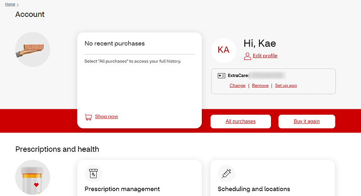
One of the largest projects I worked on was the account landing page. This was a redesign of an old version of the page, and I worked with a UX designer, two UI designers, a UX researcher, and a content specialist.
We also needed to get feedback from other teams, because this page links to many other places on the site. That meant that we didn’t entirely own the page.
My focus on this page was to give people access to as much as we could without it being overwhelming. There’s a lot of information, and a lot of links.
The designers were very interested in trying out options that hid some of the information (like accordions or carousels). I was able to provide them with some resources, like the Should I Use A Carousel website (opens in a new window), that helped them understand why hiding things that people need access to can lead to frustration. In the end, we used cards to group similar items, and our researcher ran some usability tests to determine what made sense and what was confusing.
The designers also wanted to take a friendly approach to this page, which means they wanted “Hi, ___ (person’s name)” to be the H1. There are a couple of reasons why this isn’t great for accessibility:
-
First, it isn’t necessarily clear what that heading means or what page they’re on (but there are other ways, like the page title, to understand where they are).
-
Second, some people will have prescriptions with CVS, so they’ll sign up with their legal name, but they won’t actually use that name in their regular lives. At the time, there wasn’t a way for someone to add the name they go by, and that means people might be called a name they don’t want to be called. One of the people we got feedback from said that they go by Pam, and they only got called Pamela when they were in trouble as a kid. In those cases, the attempt at friendliness might end up being the opposite of friendly.
I got some help from a content manager, who suggested alternative H1s. We chose “Account”, which makes it clear where you are. The “Hi, ___ (person’s name)” text is still there though, and it’s larger than the H1, which could cause confusion. And it doesn’t fix the issue of the names people use versus their legal name. But this was a progress over perfection situation!
Passwordless login
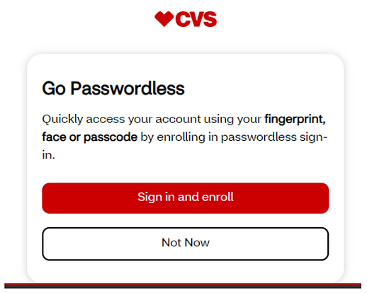
I also got to work on the implementation of a Passwordless option, which allows people to use biometrics to sign in instead of needing to remember a password.
Security and accessibility can have different opinions about what’s good for people, and this is a situation where we agree! Having the option to sign in more securely without needing to remember a password is a great step.
One thing I would have liked to have changed on this page is the word “Quickly”. Not everyone will be able to access their account quickly, even when they use biometrics, and we don’t want to frustrate anyone by giving them expectations that we can’t meet.
Accessibility defects
Some of the issues that came up frequently were:
-
Issues with focus indicators because of a combination of components and custom code
-
This was an enterprise issue that we couldn’t normally fix, so it meant there was a combination of browser default focus indicators and CVS design system focus indicators - it wasn’t necessarily a blocker, but it also wasn’t an ideal experience
-
-
Confusion over whether something should be a button or a link
-
This was something I started annotating for the devs
-
-
Image alt text
-
This was also something I put in my annotations
-
-
Missing page titles
-
Page titles were made by the content specialists, but there wasn’t a streamlined way for the devs to find them
-
What I learned
Working at CVS Health gave me the opportunity to experience the preventative side of accessibility, which helped confirm how important it is to bring inclusivity into the process as early as possible.
I also had a great group of other inclusive designers (our team ranged between 35 and 50 people while I was there) who brought diverse backgrounds and helped teach us how to be better at our work.
Making HCA Healthcare's sites more accessible
Prior to my work at CVS Health, I did two contracts with HCA Healthcare (an owner of hundreds of hospital facilities, surgery centers, and specialty sites) to make their websites more accessible. I was part of a team in the Web Shared Services department. My job was to perform audits and update the issues we found so the sites would work well for all users.
The Web Shared Services department worked with HCA's 14 divisions, and our accessibility project reviewed and updated all of the division, facility, and specialty sites. By the end of the project we had improved accessibility on more than 800 sites.
At the beginning we had a team of five "digital content specialists", two project managers, and an accessibility QA specialist. At the end of my time there, we had two accessibility specialists and one project manager.
What we worked on at HCA
There were a lot of things we reviewed and updated for each site:
-
Videos on HCA Healthcare Youtube channels need to have captions (not just the auto-generated ones) or a transcript for videos that didn’t have a person speaking
-
All PDF documents needed to have appropriate tags and reading order for screen reader users
-
Short, text-based PDFs got turned into HTML pages (because HTML is easier to make screen reader friendly)
-
Links were changed to make sure they were clear (for example, "read more" gets updated to "our oncology team"), since screen reader users can navigate a page by links
-
Each site's branding was reviewed for color contrast
-
Any old Flash content was removed or changed to something more accessible
-
HTML got updated to remove things like iframes
Tools we used at HCA
-
HCA used a CMS platform called dotCMS to house the sites - it's similar to other CMS platforms like WordPress, but it's designed for enterprises with a lot of sites
-
We used Siteimprove and Axe Monitor to run audits on the websites because we didn't have enough people to manually check each of the hundreds of thousands of pages individually
-
For bulk PDF remediation we used a company called Brailleworks.
-
Rev.com created caption and transcript files for Youtube videos
-
NVDA a screen reader that we use for testing sites
Other work at HCA
The accessibility project had sprints for each division, which means some of the time we were waiting on the facilities or the vendors and we were less busy. During those times I worked on:
-
Find Care, a large scale project to replace outdated "service" pages on each site with more cohesive "specialties" pages
-
Training new members of the accessibility team
-
Assisting the helpdesk ticketing team when they had a lot of requests come in at once
-
Reading articles, watching webinars, and taking online courses to learn more about accessibility so I could contribute more to our project
What I learned at HCA
Before I started with HCA Healthcare I had some basic knowledge about color contrast, only having one H1 per page, and that people use screen readers. I learned so much about how easy it can be to create websites that work for all users.
I also got experience using a screen reader myself (I still have to listen to it at non-superhuman speeds though!)
The things I learned in this role gave me a great foundation for creating accessible digital products.